 17.10.2018
iSinsights: Behind the infoShare curtain - how to build conference space for 6000 people?
We want all of infoShare guests, partners and speakers to feel that they ARE in the right place to build their business and gain new knowledge. So, how do you start organizing such huge-scale event? What goes into a planning list?
 Martyna Grzegorczyk Experienced Event Manager who organized numerous international events up to 6000+ attendees, all over Europe. Her specialities include event management, production, and crisis management. Privately, she is passionate about travel and has self-organized trips from Peru to China on five continents. When she doesn’t travel, you can see her dancing Cuban Salsa.
We want all of InfoShare guests, partners and speakers to feel that they ARE in the right place to build their business and gain new knowledge.
So, how do you start organizing such huge-scale event? What goes into a planning list? And the most important how to achieve the conference harmony - at the same time - make sure everything is ready on time and to the highest quality? Let me show you infoShare 2018 behind the curtain.
CHOOSE THE PERFECT/SUITABLE VENUE and sign the contract
For sure I do not have to explain how important is to choose the right event space. We decided that Gdansk is the perfect place to host it, it’s been like that since 2007. Luckily, for InfoShare -scale event, we have locations in northern Poland that can fit in such a big tech crowd. The unlucky part is - there is no endless supply of such big conference spaces. For a few years now the conference is held in Amber Expo exhibition center, and that is why we need to book and secure the conference space years in advance. Then one year before each edition we discuss all the agreement conditions.
CONFERENCE SPACE DESIGN IN PRACTICE
Huge Expo Venues like Amber Expo are usually empty halls - we have to built everything from scratch to what you can see during the conference. How do we do it? :)
TIMING IS EVERYTHING
Timing is crucial with events of such a scale. Not only event space has to be secured in advance. When attendees start to go back home, when first reviews and feedback after the event starts to pour in - we already plan and work on next year’s edition.
LIST THE AREAS WHICH HAVE TO BE BUILT
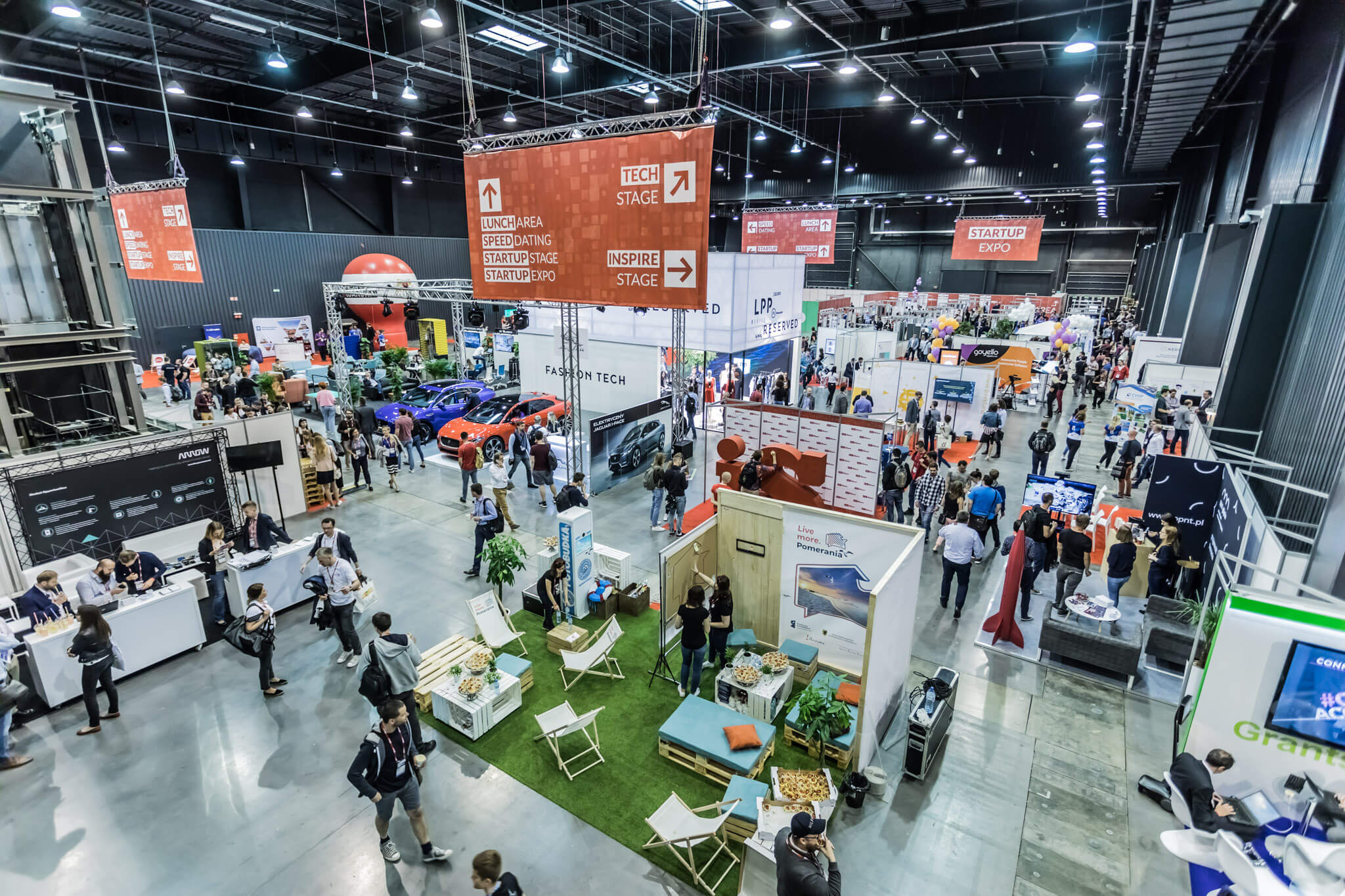
Event space is like a small city - we need to plan everything - beginning with the “streets” and end up with buildings. So firstly we are discussing as a team which areas we are going to have in next edition.
infoShare conference zones:
- stages - we had 7 of them in 2018!,
- networking areas,
- working area for attendees,
- exhibition zones for our partners,
- exhibition zones for startups,
- Media Area,
- Workshop space,
- Reception, information and check-in points
- and the most important of course - lunch zones ;)
You cannot forget about the backstage areas too :)
Need some visualing? Check out the video of how it was built here:
DRAW EVERYTHING :)
When you decide what has to be built - taking into account the number of attendees - assess how big the particular areas should be. I have to my disposal 12 000 m2 of floor space and thousands of cubic meters of “air” to fill in with visual communication aids - so without precise plan I couldn’t have managed it.
I first start to draw everything in a basic Excel spreadsheet, then it gets translated into Corel designs. Check out a few of the technical sketches and final design for attendees below.
Detailed venue plan
Simplified infoShare conference plan for attendees
Designs you see above represent 100% to scale every single power outlet, water supply chain, internet access point, branding, chair and everything else in all zones. We have to have it mapped out for us and officials.
Such detailed plan takes long to prepare and once you’re done with it, you may think that now everything goes smoothly… but, not so fast! We have bunch of crazy ideas in the InfoShare squad on how to make your conference experience better so… it’s back to drawing! For the last infoShare I made over 30 iterations of the conference center designs. All thanks to our crazy ideas and improvements ;)
The files then go to the conference center, fire marshall, security, EHS officials - basically everyone who needs to see them and approve it, before we can even walk into the conference center and start the work. Safety of all attendees and crew is a priority for us, so cooperation with the right authorities is most important.
And once the sketches are approved - that’s it. They are finalized a month before the event. From then, no big changes are allowed.
In the spirit of making sure everything is nice and proper - we also have to check the design of all partners’ stands and see if they adhere to the safety standards or if their plans are even possible to become a reality!
USE ALL THE SPACE YOU HAVE
We use all the space we have available. Not only the floors and walls in the venue. Hanging communication banners from the ceiling constructions is a must have. Some partners also require specially made hanging visuals over their stands.
What is most important thou, when you hang lighting, sound equipment and stage construction - venues have restricted areas where we can’t just hang anything we want - even if the space suggests it is possible. There are weight limits or security measures that prevent us from it. This is an additional challenge while planning.
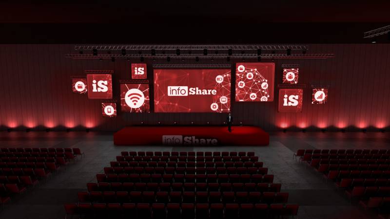
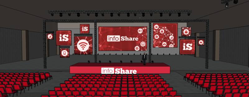
Weight limits can weigh you down… literally. In 2018 edition the concept for the stages was that all the screens and branding could be safely hang from the available ceiling constructions. We were wrong :) Turned out that the hanging points’ weight limits won’t be enopport for the equipment and branding.
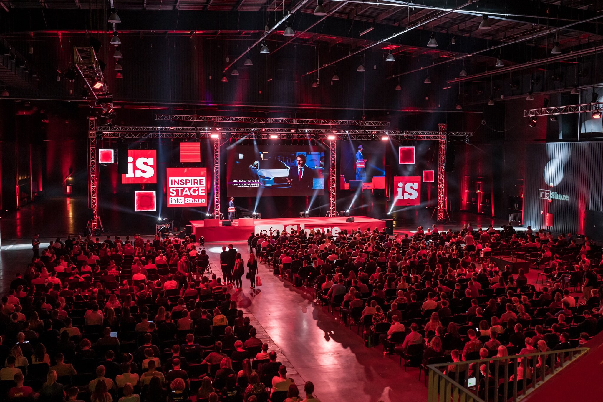
So… it had to be adjusted. Additional hanging frames were built to make sure everything is safe and looks almost identical to the original plans. Check out the before/after screen below AND the final effect. Pretty cool, right?
STAGE PRODUCTION
This is my favourite part. At infoShare we have not one, but seven stages to take care of. We need to design them in a unique way (which is not so easy especially when you have budget restrictions in the back of your head). We want attendees to feel the experience and atmosphere of the conference, just like they would take part in a big, colorful show.
To envision how the stages will look like, we use a brief of how the stage has to look like and what are the technical requirements we need to make sure it all is impeccable. This brief is a basis for tech/multimedia agencies we work with. They build detailed visualizations for tech and construction crews to use before the event.
Here are just a few of things we need to make infoShare conference looking, feeling and sounding great:
- Advanced lighting that can build dynamic effects
- Digital stage banners to present multimedia content
- Different size screens, from standard 16:9 to square
- Lightning projections and presentations for walls and ceiling
- Advanced sound equipment
- Additional content e.g. images from live cameras, video, speakers’ presentations or animated branded graphics.
Each of the scenes, because of their own unique theme has its specific requirements. That is why we need a separate brief, visualization and tech raider for all of them. But still, we cannot forget that we have limited set of possibilities.
EQUIP THE ZONES
You can’t chill while standing...
Another timing/planning issue to solve is the furniture. Bear in mind we start the halls with literally nothing in it. Everything has to be bought or rented. And InfoShare is not the only event in town (or in Poland) that day ;)
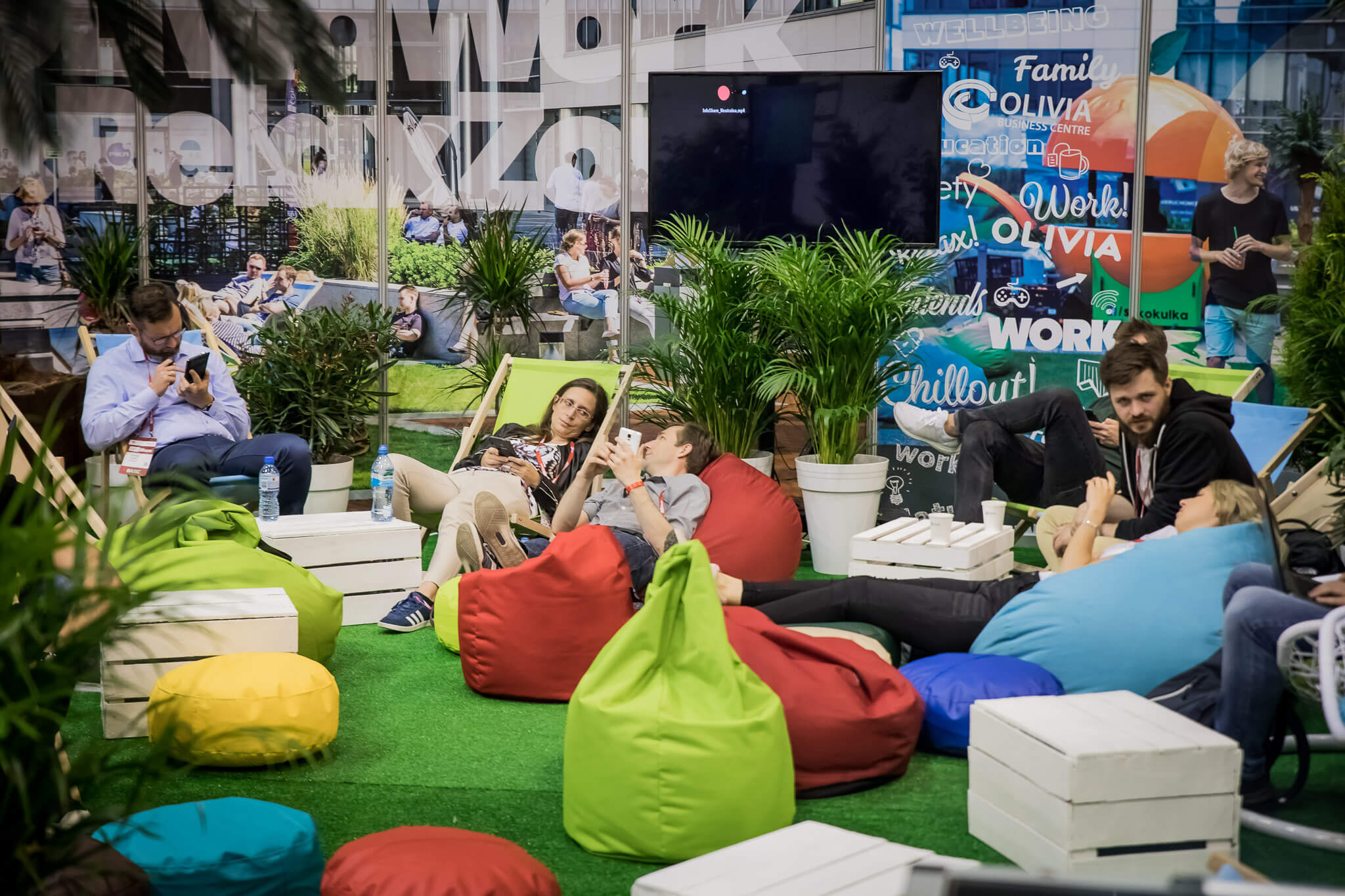
So how do you plan for it in advance, so make sure you have enough sitting for everyone to comfortably network, eat, chill and learn? How do you secure such huge amounts of chairs, bean bags, crates, stands, trash cans, tables, partner zone furniture and equipment is there on time? By making sure the offers from companies come in early and you are the first to order anything and everything.
No wifi-no life
Try to imagine a modern conference with no free wifi access and power access points… mayhem, right? ;) The same goes for coffee or water stands - you just simply can’t work or learn effectively without the refreshments.
So, before anything else happens - hundreds of meters of cables and power outlets need to be planned and laid down. An indoor sewerage system for refreshment stands needs to be build. And wifi networks have to work - not only one but a few of them - one for attendees, one for tech crew and one for infoShare staff.
VISUAL COMMUNICATION
Each year we sit down, as a team and set the conference theme. Based on the theme we plan specific visuals from colors and iconography to more advanced visuals like screen animations. It has to be clear and easily recognizable, familiar to the guests.
As conference organizers, we need to put ourselves in the attendees’ shoes. What is the ultimate conference experience for them? When I walk into a conference space, I want to know straight away where the different zones are. I need to be able to quickly move from point A to point B and can’t be confused by signage or contradicting info. I need to have the same good experience no matter if I sit in front or in the back of the room.
For 2018 infoShare edition we designed and placed strategically:
- Hundreds of octanorm stalls
- 449m2 of posters
- Over 300m2 of branding and information banners
- 200m2 LED screens
- Additional screens in the center of stage areas and in front of the stage entrances
- Additional maps and conference agenda printed on ID badges (various versions depending on access granted/ticket) and leafleats
Everything was ready and printed at least month in advance, allowing for any last-minute “crisis aversions” in case anything was going to change unexpectedly.
FINAL THOUGHTS
Any conference you see these days is more and more a combination of knowledge sharing, networking, business exhibition, career advancement opportunity.
As organizers, we need to strive to create the best possible conference space, so those goals of our attendees and partners are met in an environment that’s build for us, humans, to feel good in. We’re responsible for the ‘make or break’ of a conference experience for each and every person entering InfoShare zones.
As someone who worked on 3 editions of infoShare already, I hope that each edition was better than the previous one. Let me know if you want to know more about what’s behind the infoShare organizational curtain and check my LinkedIn profile :).
Tags:
See also:
LATEST NEWS
Od czego zależy sukces wdrożeń AI? - polskie i amerykańskie trendy w branży tech 24.10.2025
Five highlights from EU Space Days 2025 13.06.2025
🤝 Networking i zabawa na Infoshare 2025 30.04.2025
⭐ Spotkaj liderów innowacji | Keynote Speakers 23.04.2025
🎸 Zagraj na Great Networking Party | Call for Bands 16.04.2025
🏆 Gdańsk Startup Award – Twoja Szansa na Sukces! 09.04.2025


