![[EN] We’re coming closer. The re:infoShare focus group interview and interviews with the experts are already done!](https://infoshare.pl/system/cache/img/koszulki-69p9ense02f0.jpg) 18.07.2018
18.07.2018
19.03.2019
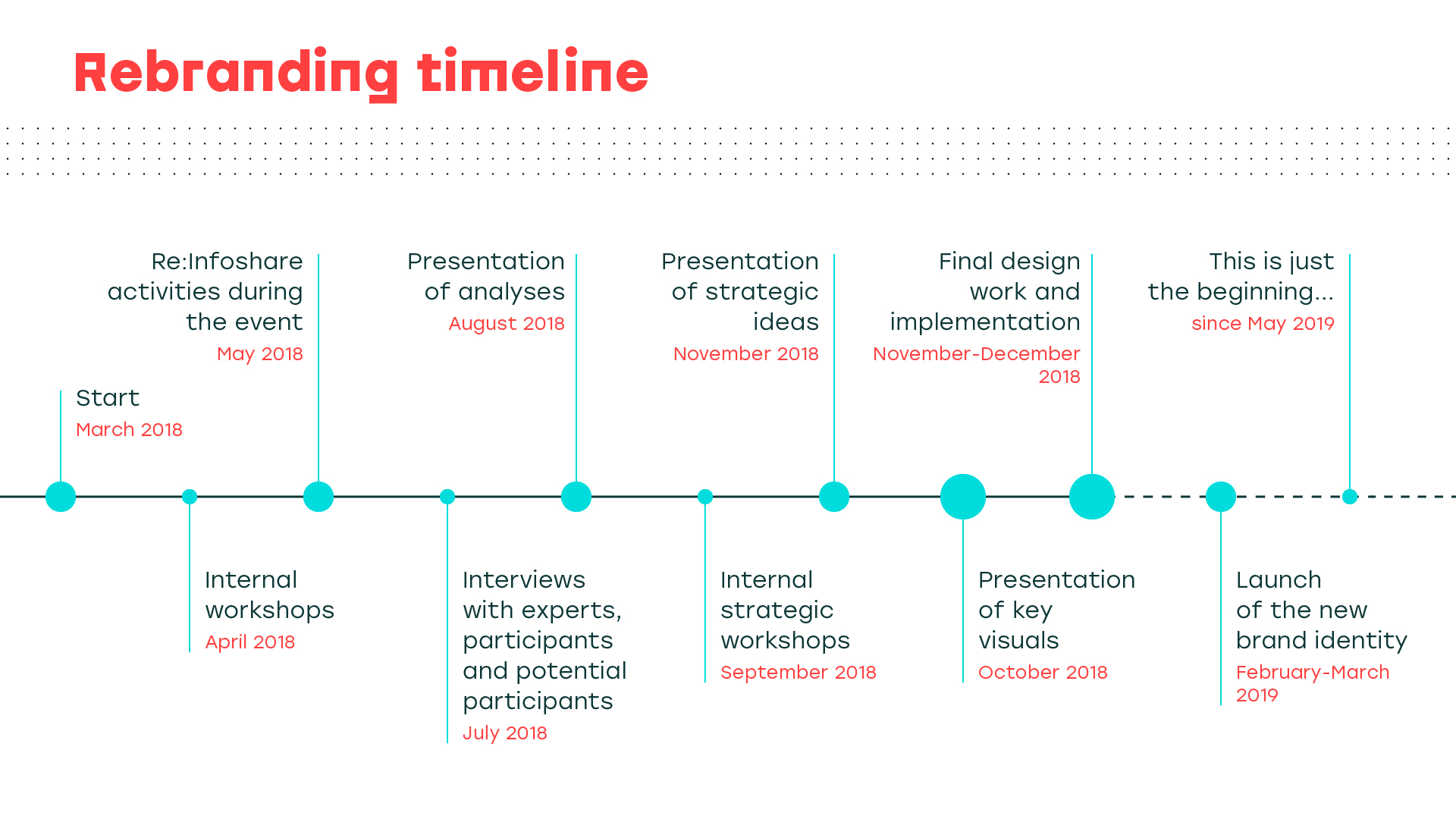
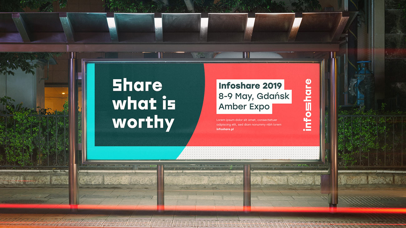
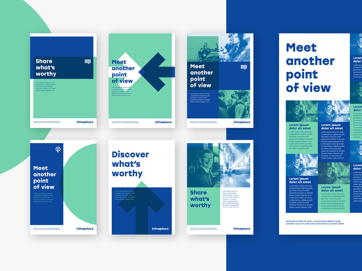
Finally we’re here! Summing up a year of hard work. It was worth it! Launching InfoShare’s new visual identity.
We are ready to show you the results of twelve months of our work, although it’s not the end of the road yet – more the beginning. We will soon meet at Infoshare and that’s when you can see the rebranding in all its glory. Today we are announcing the introduction of our new visual line and briefly summing up last year’s developments.
We are ready to show you the results of twelve months of our work, although it’s not the end of the road yet – more the beginning. We will soon meet at Infoshare and that’s when you can see the rebranding in all its glory. Today we are announcing the introduction of our new visual line and briefly summing up last year’s developments.
"We want Infoshare to help you find your own way" - G. Borowski
Sharing know-how and creating space for a mutual exchange of what the participants consider valuable, has been Infoshare’s vision from the beginning, that is 2007. Within the course of years we have changed.
The scale of the event is one of the main changes. We are now much bigger - every year Infoshare is visited by a few thousand people. For this year’s edition we are planning 9 thematic stages, more than 150 local and international speakers and there are more than 600 startups from 5 continents registered for our Startup Contest.
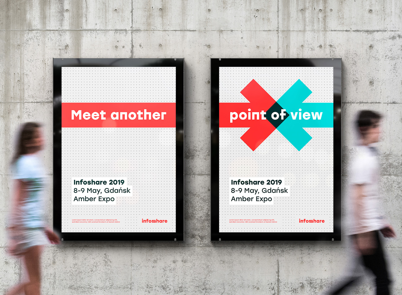
There is, however, something that doesn’t change through the course of years – our values and ambitions to give you more expert content. We’re acting as a mentor who in times of information overflow shows what’s valuable. We’re not judging and neither are we showing the one and only solution. We want to start a discussion. The refreshed logotype underlines this - also visually.
"Open source, open rebranding. Why not? - T. Pawul
Before we started doing any work, we made a condition: the rebranding process will be in an open mode.
“Open” has many dimensions:
- it means that all work done is transparent,
- it involves the users, inviting them to participate and influence the process and thus its end results,
- it encourages mock-ups and trying out different solutions.
An open rebranding let us understand you better and build a brand that matches your requirements and needs.
From the beginning, we wanted to play with the way we communicate this change and so we developed a creative idea and coined the term “Re:infoshare”. It underlines receiving feedback and answers to questions. Following this idea, we created characteristic black-yellow-white graphic designs conveying the message that this is just a transition stage - “under construction”.
The idea of Re:infoshare let us cover the whole transition process from the old to the new brand vision. We’re slowly finishing it!
„I am completely lost in the maze of information about new technologies" - Infoshare attendee
For a few weeks we conducted a wide analysis of the brand and its surroundings. One of the most important conclusions made was that there is a lot of information about new technologies that is hard to digest and to keep up with, especially when we consider how quickly innovations appear.
While going over Infoshare’s visual communication it turned out that:
- there are discrepancies between what we say and what we actually want to convey,
- the brand design is outdated (Fully right! It was designed more than 10 years ago),
- as the conference grew bigger and bigger, colours stopped helping in differentiating categories: we used them to mark scenes, tickets, types of speech, sub-brands. That needed sorting out.
Anyway, the workshops showed us, that we think Infoshare is mostly about providing knowledge. When we compared this with your opinions, you told us that’s not all – Infoshare is also unique entertainment: plenty networking possibilities, the before and afterparty and cruises.
Conclusions from this research let us get a hold of your perspective and plan design works that will create consistent communication, both verbal and visual.
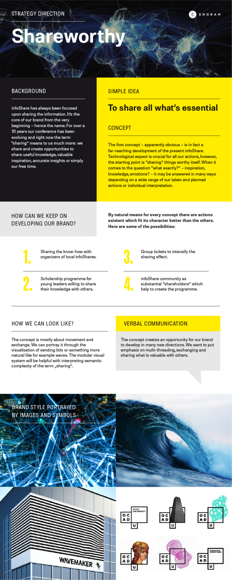
"A highly diversified offer. Common theme: we're sharing what's worthy" - K. Walecki / Engram
Following few months of analysis, the time has come to create the brand strategy prototypes – assumptions on which our visual and verbal communication will be based on.
We suggested three such prototypes, giving them temporary names: Share, Beacon and 1+1=3. Each concept could be seen on social media and you had a chance to comment on it.
Share was based on the observation that Infoshare has always concentrated on sharing information, also in its broader meaning. In this context “Information” means also inspiration, experience, emotions and play. Brand’s tech aspect remains key in all the activities.
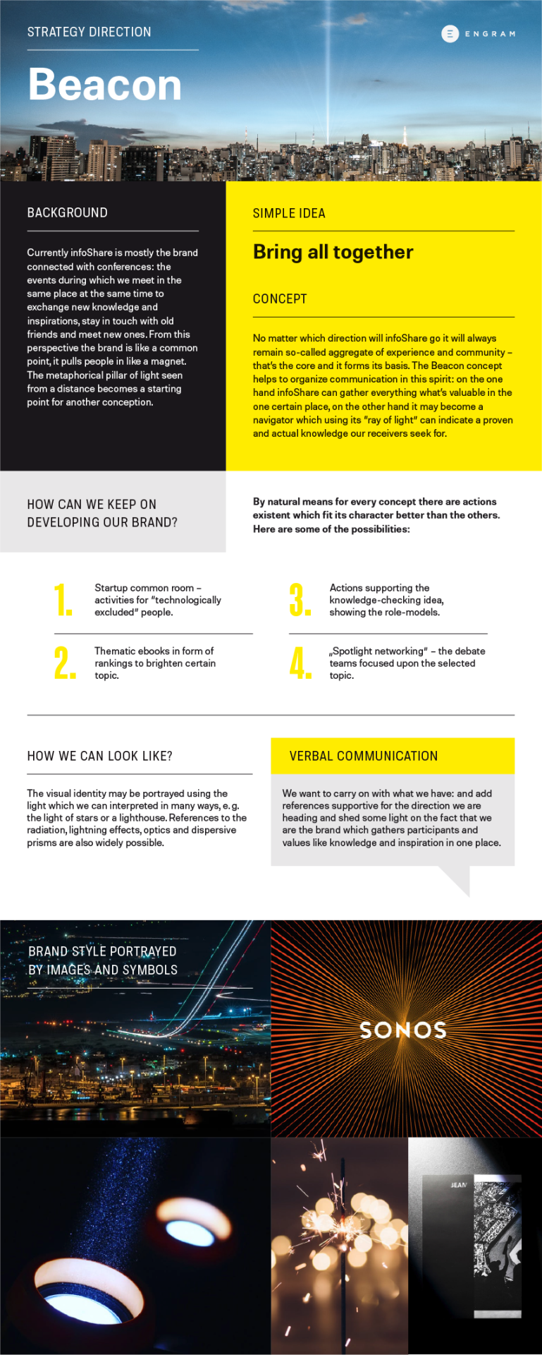
Beacon’s basic assumption was that through its actions the brand “sheds light” on important information, separating what’s valuable from the insignificant. On the other hand, because of the conference, the brand is a place where people meet and exchange experience – it is all happening at one place in time. A metaphorical beam of light that can be seen from a distance and one point where everything happens were the creative assumptions behind this idea and the phrase “Bring all together”.
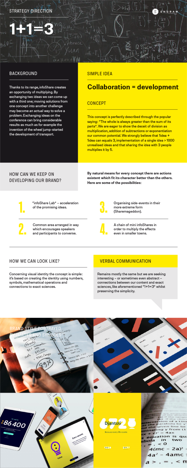
The concept 1+1=3 was born from the idea that “the whole is greater than the sum of its parts“. When we exchange two ideas, a third one can be born. Numbers were an important factor in communicating this concept; that’s how we wanted to show how dividing, multiplying, summing up differences or joining our potentials plays a role.
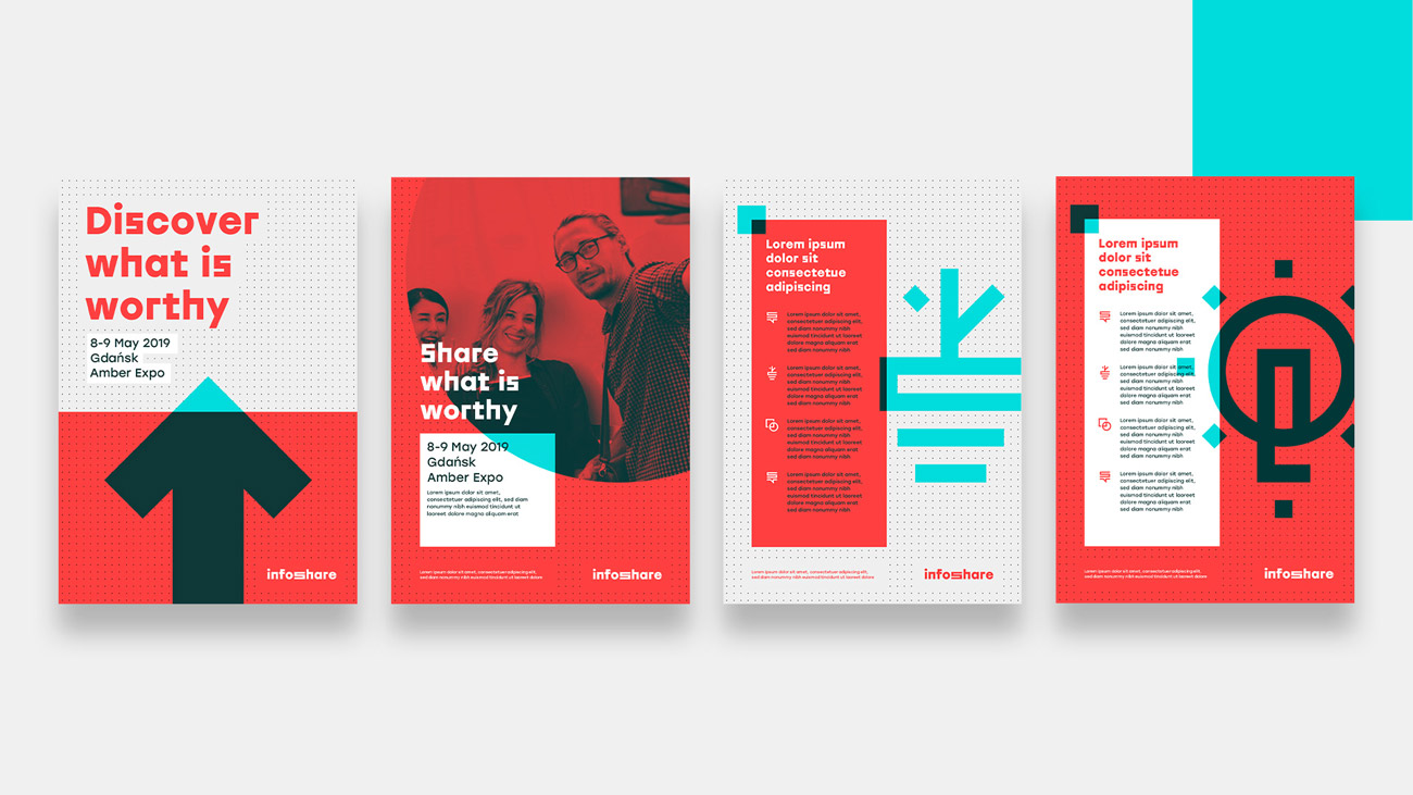
We finally chose ‘the Shareworthy’ concept which was created after a few mild modifications of the Share prototype. We decided to put more emphasis on precising the concept’s big idea: “we’re sharing what is worthy”, leaving the insignificant information buzz behind. We want to create a space for sharing and share content that is most valuable in terms of your development.
"Option 1 and 4, definitely... but I feel sentimental about colours in 3rd" - Infoshare fan
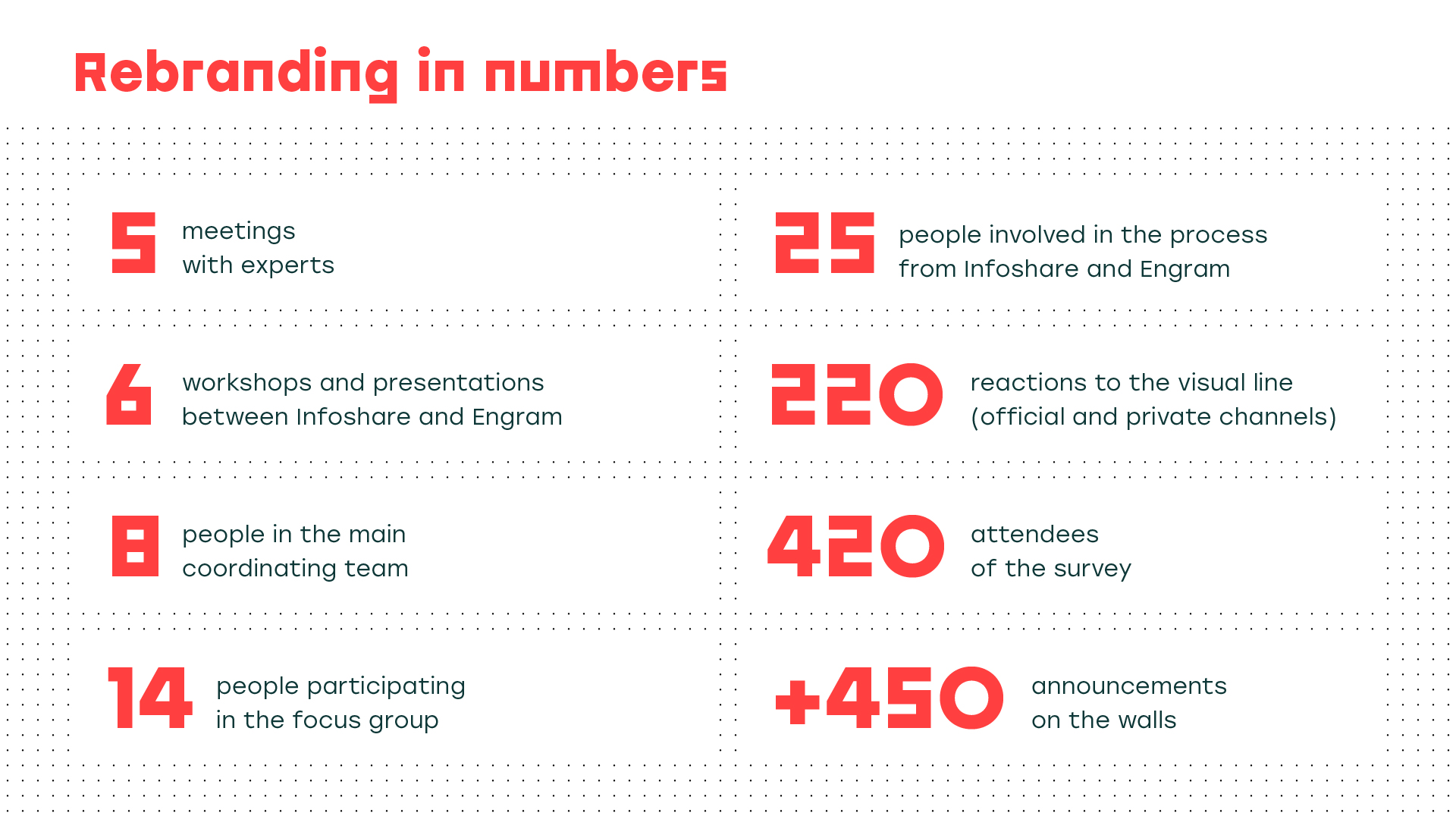
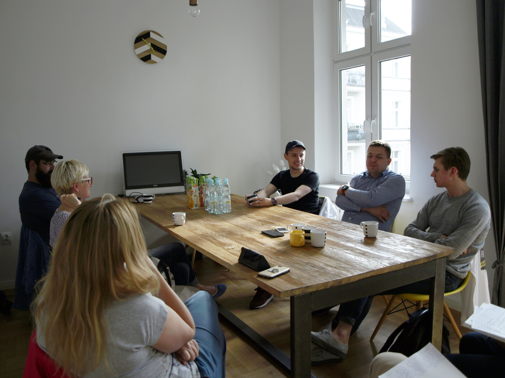
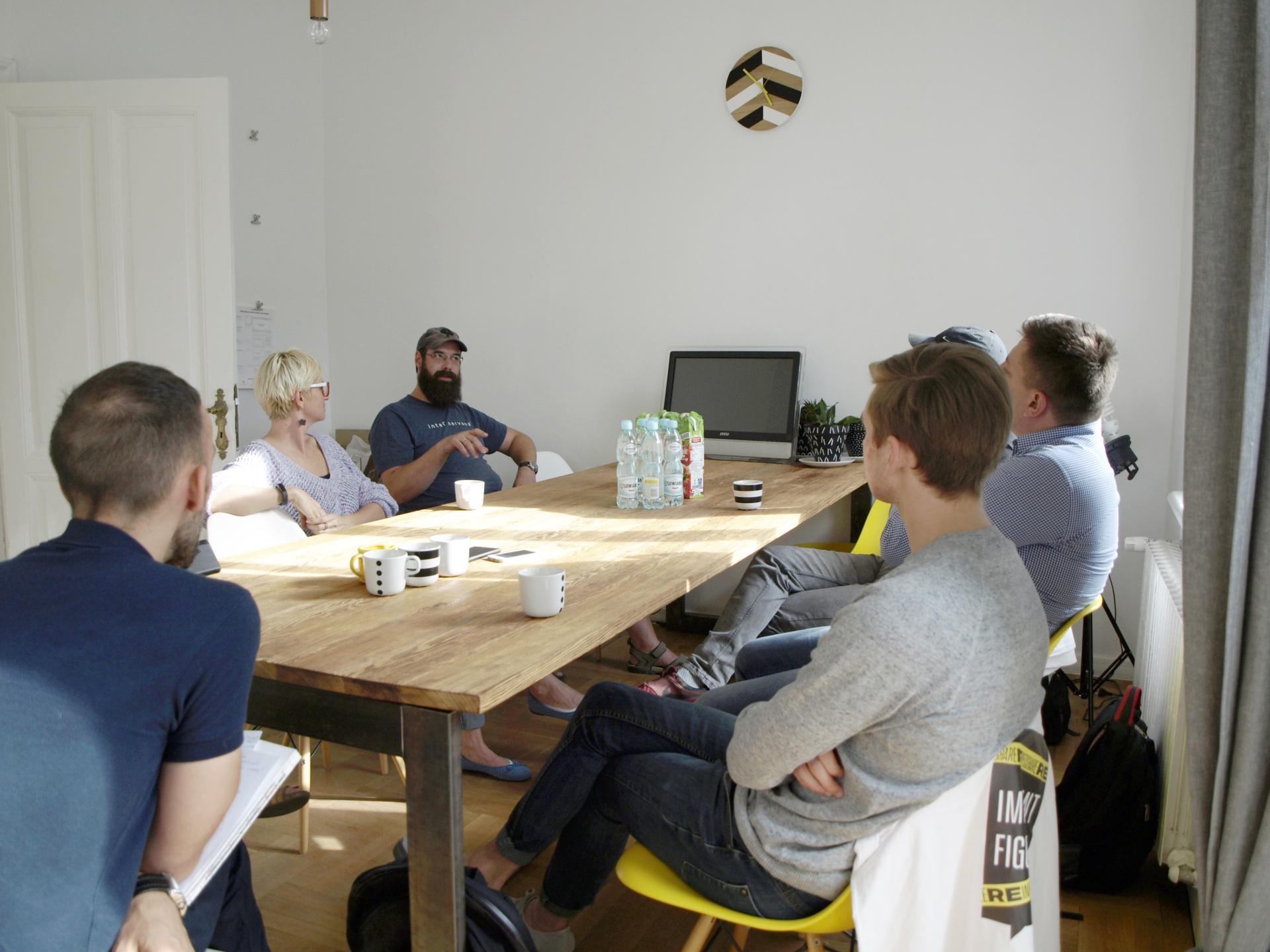
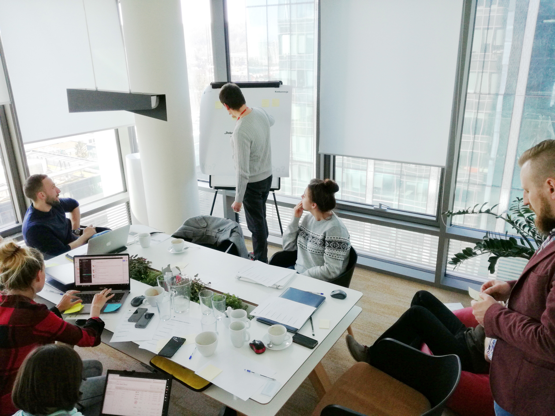
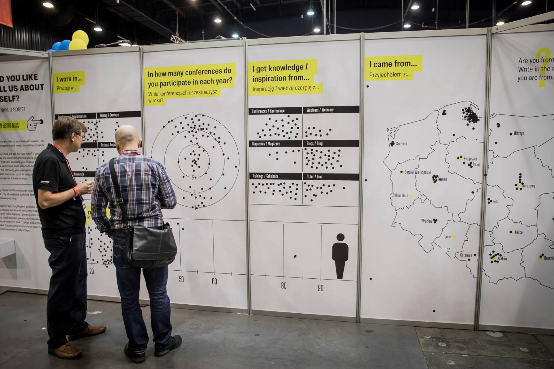
In order to know what should be our direction we have been engaging you into various activities. First consulting started at the event with responsive walls where you told us about yourselves and your inspirations. At the same time the Engram agency was shadowing you – investigating what is most engaging for you at the conference.
We also did focus groups. That’s what helped us understand the user perspective better – why do you want to be part of the conference and what scares you. What did we find out? These are the 3 needs of an IS participant.
- the need to explore new topics and areas of knowledge that cannot be found in a book,
- the need to filter out the most important information,
- the need for the conference to be attractive, to provide emotions.
During this time we met both the programmers from top-notch companies, people from specialized marketing agencies and a startup founder from the biotech industry. Thanks to all the information obtained we could try to accomplish this difficult task of matching the new brand communication to the needs of all its users.
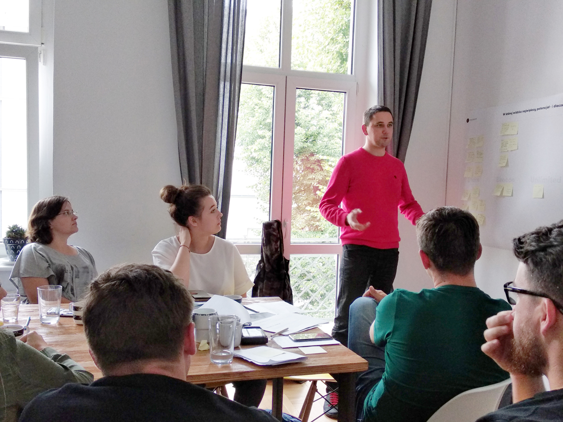
The next phase where we managed to get you really engaged was presenting initial brand strategies and consulting the first visual outlines. A heated discussion in social media followed.
What regards the opinions themselves, one of the ideas – Share – was the most popular, which confirmed the need identified during the group discussions – looking for cutting-edge solutions, knowledge.
As for consulting the visual line, we were surprised by a positive welcome – although those were prototypes. You understood us and the need to have the work shown at this stage of the process. Many suggestions like that “we had gone too far from the original colours” or that “a clear message is the key”, helped us considerably to create the final lines.
„Logo itself doesn't tell us much. We need to think about the whole" - A. Ignaciuk / Engram
A brand such us Infoshare must be easily identified even when the logotype is not visible. There are many fields where the brand is present – both in a graphic version – as visual identity or a communication tool. Take for example the big conference venue – 12 000 square meters. We had to consider the need to design many different graphic elements – screens, signposts, promotional boards.
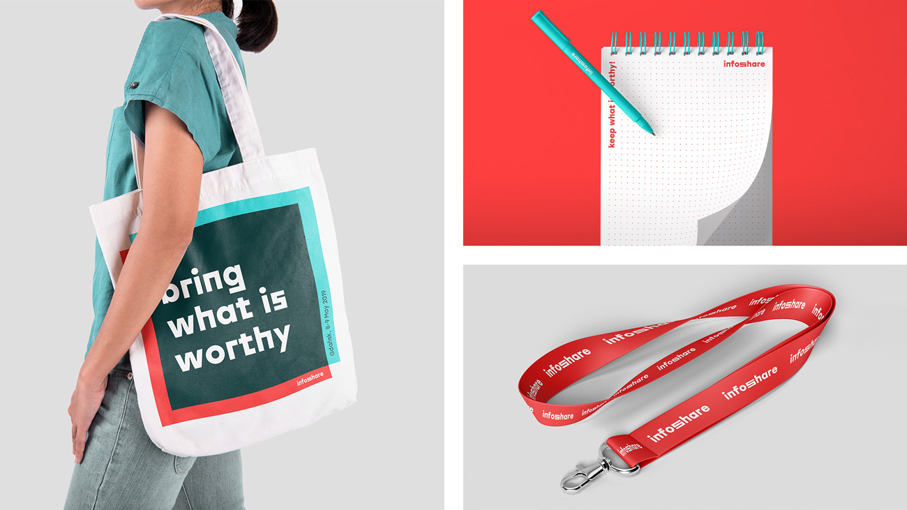
But that’s not all. As InfoShare communicates with the user on a daily basis, we had to design many other elements that match the brand identity. The logo itself is in fact the foundation for identification, but at the same time a very small element of the system. Everyday identification must use many more elements that maintain the character of the brand, such as typography, colors, and characteristic patterns.
There were three ultimate visual lines, from which we chose one and polished it – also with your help.
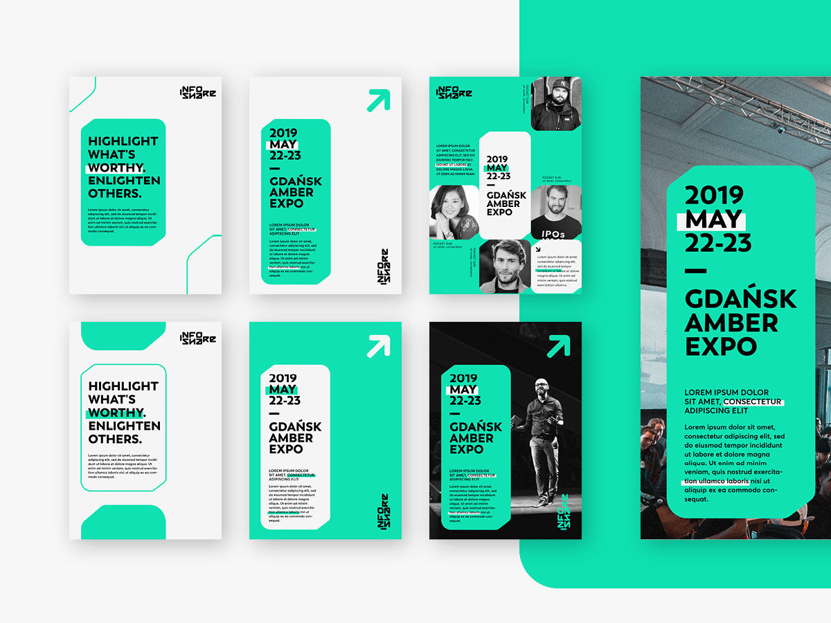
Concept: „Find – Highlight – Hand over”
- visual communication underlines what is important,
- font type resembles code,
- the badge shape resembles „post it” which is a symbol of important notes.
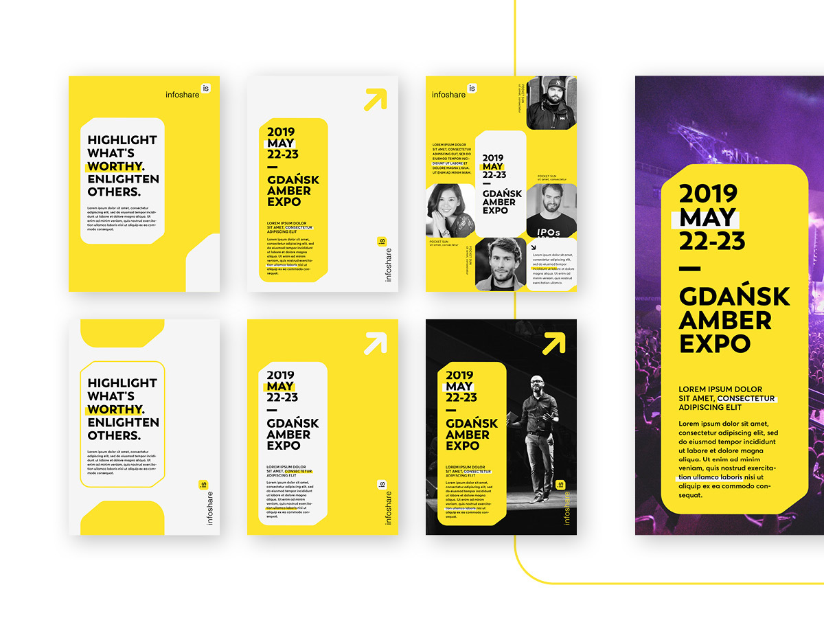
Concept: „Space”
- logotype shape has a „tech look”,
- is also a symbol of fast information transfer ,
- playing with spatial objects to achieve „common ground” for a variety of – sometimes contradictory insights.
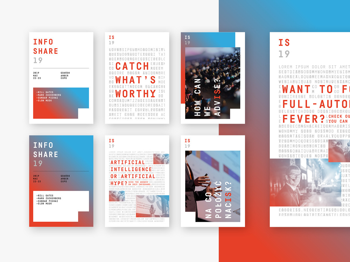
Concept: „Information buzz”
- re-arranging logotype elements built of code,
- sign’s message reduced to minimum,
- selection is made according to priorities,
- heading towards graphically visualising taking out the most important messages out of the information buzz.
The final result of the work above, the new InfoShare visual line, is born out of the “Space” prototype that includes also some elements of the other concepts. It’s a combination of modernizing the brand while keeping its deeply rooted features. One of the most important issues here was the red colour. It was representative of the brand and it wouldn’t be good to cut it out. However it needed to be refreshed and modernized.
„That's going to be a long journey. We will make it, won't we?" - P. Bochenek-Styrylska
Soon a year will have passed from the moment we started work. Looking from this perspective we can see what went well and what could have gone better.
For sure the IS team and agency have become partners very quickly. We worked like one department where both sides have complementary skills: Engram specializes in rebranding and design, and IS in event management.
We were so much into this process that we signed an agreement when the project was already finishing. We’re not saying this is a practice to follow, but that did not influence the cooperation in anyway – a mutual trust was created during the workshops.
There was one thing we didn’t have enough of – that is time. This is quite typical for rebranding, however here it was a real pain in the neck – because of the scale of the event and the necessity to provide the majority of graphic designs by a certain date, that is the conference date. Engram created the key visuals; the rest is done by us simultaneously, according to needs.
Of course, there are at least few more months ahead of us till we’ve finalized the rebranding. We’re starting work on our new website. We also want to tell you more stories about this year’s activities. We promise to make a useful e-book guide together with Engram. We will share what we have learned in the rebranding process – conclusions, suggestions and practical tips you can implement when redefining your brand.
Gallery:
Tags:
See also:
![[EN] The dust slowly began to settle after infoShare. We finished the first stage of re:infoShare!](https://infoshare.pl/system/cache/img/baner-news-2-1adrd99jkero.png)
![[EN] The re:infoShare project has just started! We are very curious about your opinion.](https://infoshare.pl/system/cache/img/baner-glowny-1-567i0qgslrc0.png)
LATEST NEWS
Nowoczesna aplikacja — jaka jest i jak ją stworzyć? 19.04.2024
Feedback czy rada? O mentoringu w świecie IT 18.04.2024
Influencerofobia — Wy też ją macie? Sprawdźcie to, podczas Infoshare! 17.04.2024
Infoshare bez barier — accesibility na naszej konferencji 11.04.2024
Ograniczenia istnieją tylko w głowie — czy ADHD może być zaletą w świecie biznesu? 04.04.2024